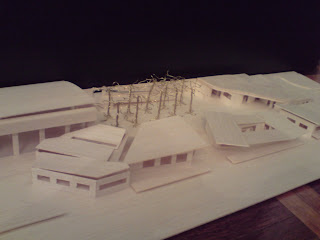


Finally, after 14 weeks, my design is complete. In john's words-long story short, my design was heavily influenced by the surround natural landscape. i wanted my design to fit, and engage with the landscape, rather than be inferior, and not engaging the its surroundings, hence the organic curved shape in the plan. Heavily influenced in the final stages of design by Gregory Burgess, i played with the roof form, and the playground ground, to combine the built environment. Having the rooms under the mound, especially the large multi purpose room, creates a tension with the large gym, via a dozen trees in parallel, creating a picturesque view like Tadao Aando's church on water. If i move toward the form, all the facilities are grouped together like a rocks ina river, yet have pockets of release, through gaps revelaing the view to beautiful coogee beach. If you see the western elevation, there is a succession from natural environment, to built; so one would see a natural green grass mound, followed by a concrete base, with uneven rustling tree canopy above, flowing on to the large gym with its slender slits in the all wooden construction, giving the design a gentle and natural feel to it.
i must say, that this term hasnt been the easiest for me by an means, and John can tell you all about that. However, for me, this term has been one of much learning, and i know that through John, even though sometimes it was really downgrading, i must say im very thankful for his guidance. thanks John.


 This next design was more carefully thought through. It is influenced by the form of the coastline, and the progression through the spaces, giving the rooms which i saw fit, the best possible view for the people inside the space. Playing with the roof formation was a major aspect, depicting the unpredictable sculpture of rock formations due to water erosion. the center area is like an italian Piazza, open, natural, and welcoming, funneling people through the buildings which opens up to the vast oval space. apparently this is on the right track, so ill continue with it in a positive way!


